Hope Saúde
About
Hope is an online health management startup that emerged from the tiredness of bureaucracy and the high prices and dubious quality of traditional health plans. Hope’s proposal is to take care of the lives of its users in a preventive way, allowing exams to be booked, online consultations, scheduling face-to-face appointments, and access to partner laboratories and hospitals, all fast, easy, practical, and through a monthly subscription.
Challenge
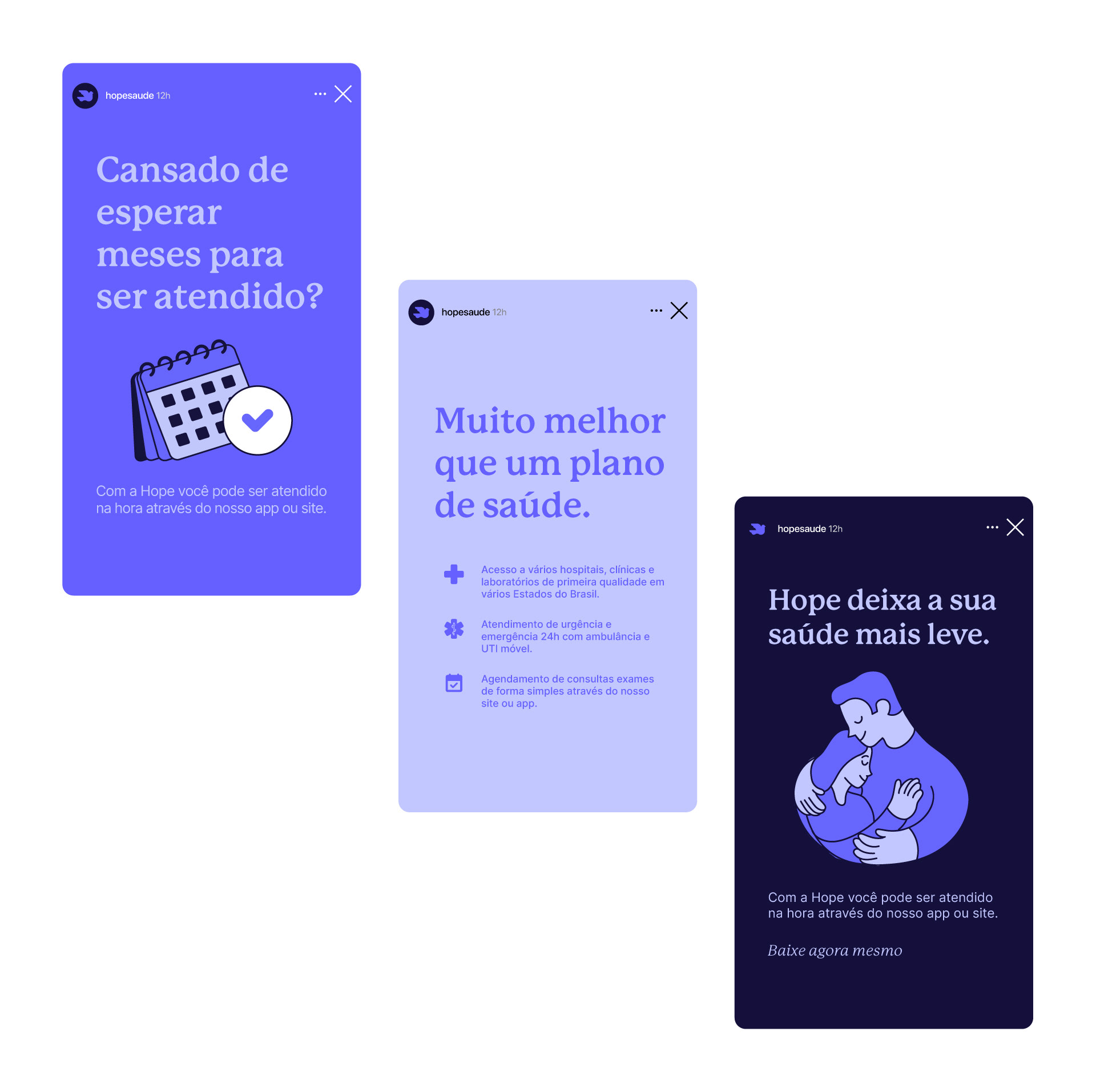
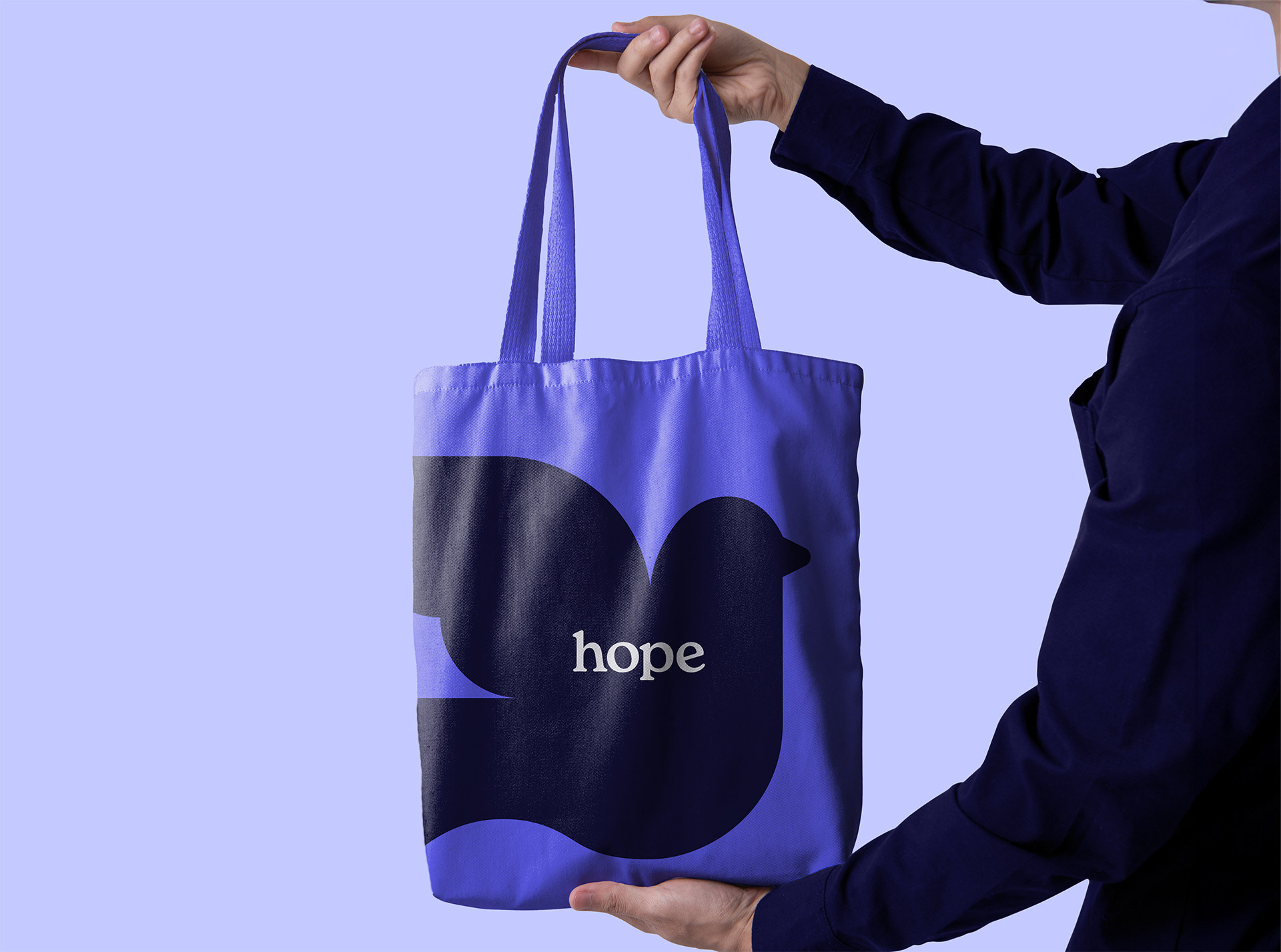
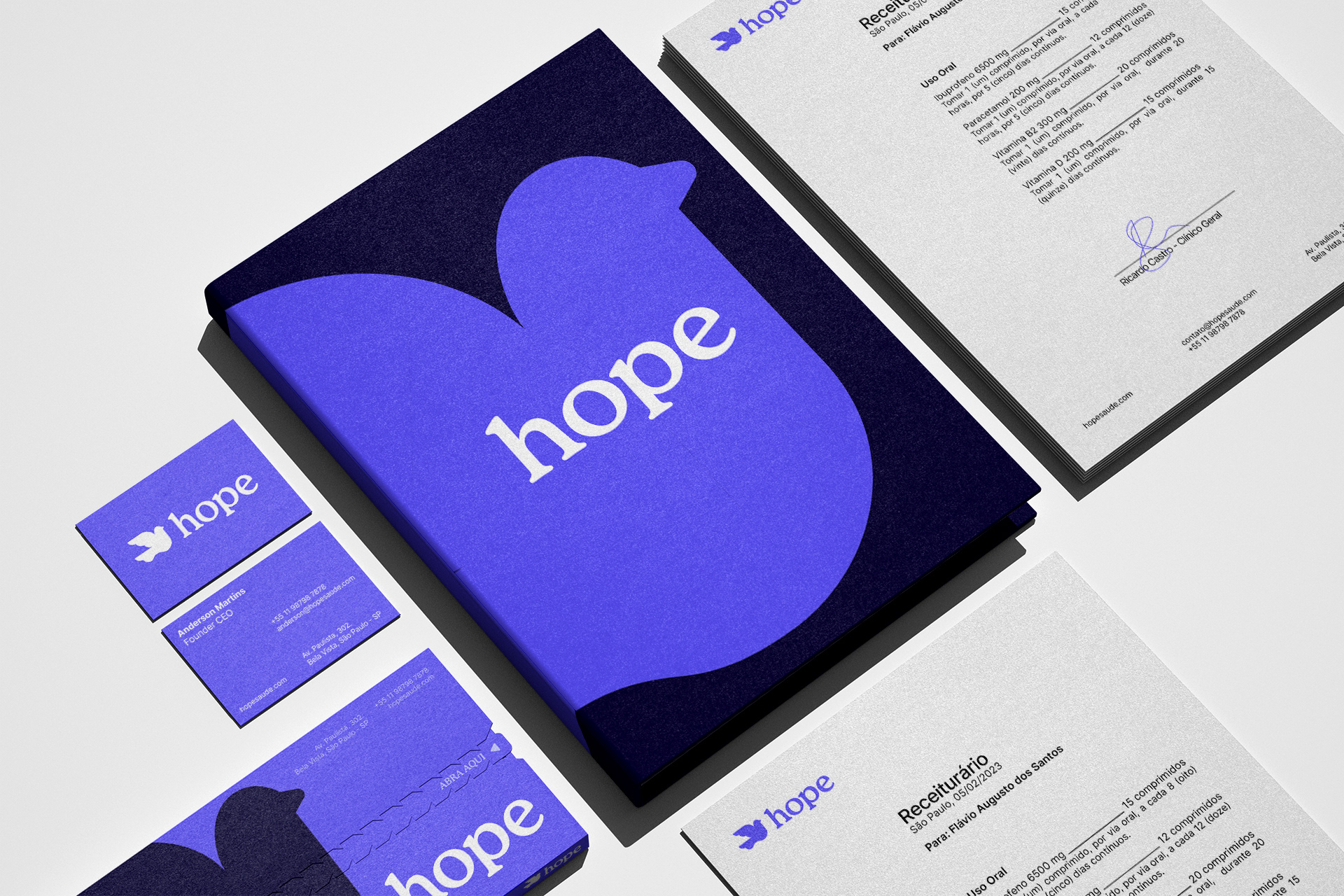
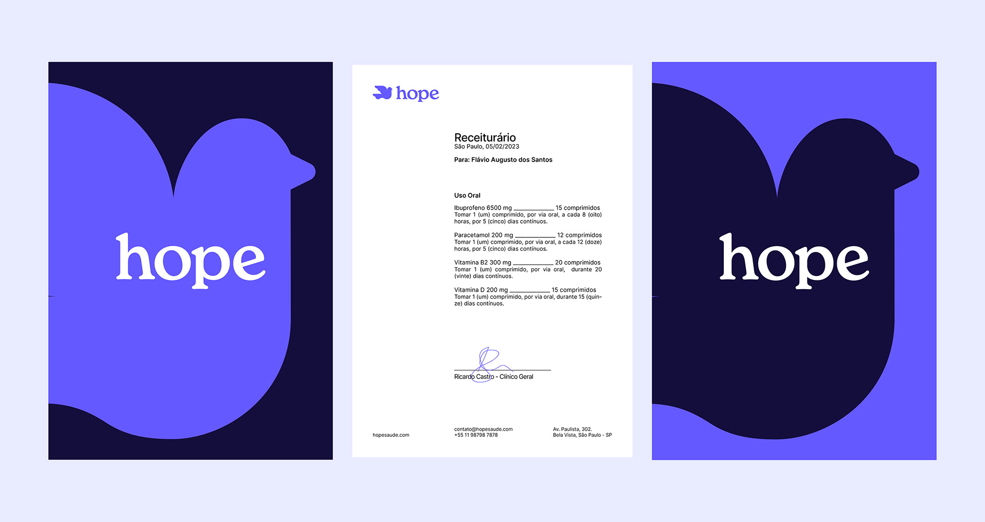
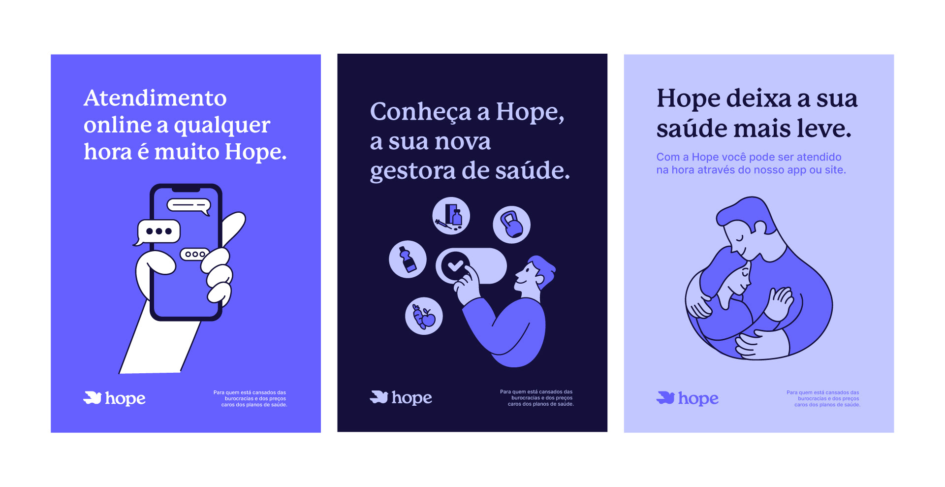
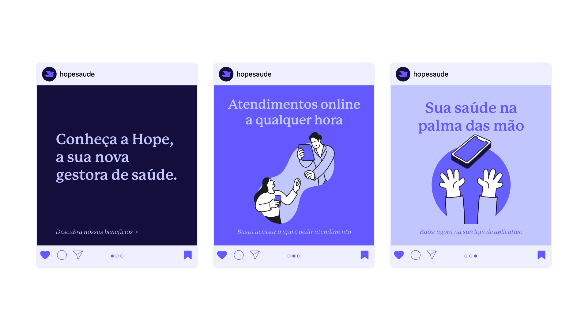
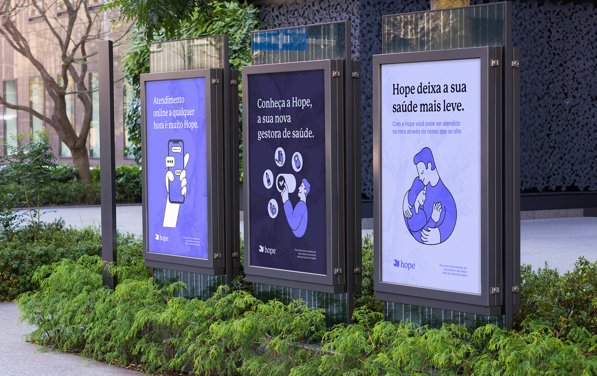
Our objective was to build a tone of voice, strategic brand positioning, and a visual identity that gives Hope simple language and light and friendly personality in all its forms of contact with the customer. We tried to build the logo design, lettering colors, and other elements to strengthen this message. The colorful and colorful elements reinforce the idea of being a brand that escapes the more sober visual standards of the health market. The main symbol of the brand is a dove, a universal sign of peace and tranquility.
Services
Visual identity
Illustrations
Team
Creative Leader: Leo Tavares
Illustrations and design: Leo Tavares, Lucas and Nando Storalic